

They’re here! YAAAAAYYYYYY!
I posted back in March about the church’s announcement of a new edition of the scriptures to come out in August. Well, folks, it’s here and I had to go out and buy it, and I thought I would post what I think of them so far.

The first thing I noticed when I unwrapped my new quad (normal size, black) was that the cover felt really nice. The little insert that is included under the shrinkwrap says, “This simulated leather is specially designed to look and feel rich and supple.” Let me tell you, it feels LOVELY. I found myself wanting to pet and caress it. Buttery soft, believe it or not.
Two bookmark ribbons are included and I noticed they are a little bit longer than the old edition. Also, I was surprised to discover that my new 2013 quad was thinner than my old one!
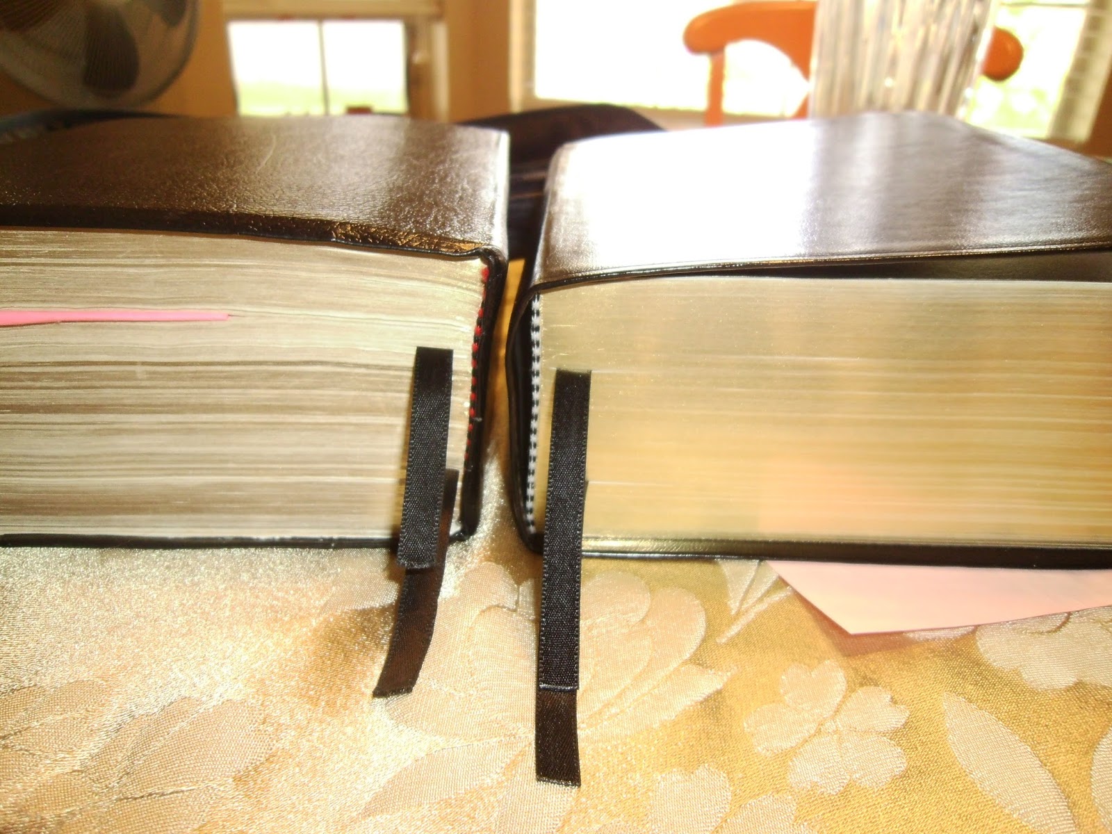 |
| Old on the left.. New on the right. (Also notice the difference in cover texture) |
The Topical Guide is 18 pages shorter, and the Bible Dictionary is 31 pages shorter. I felt like the Topical Guide was a little more readable with the change of starting a new paragraph for references in a different standard work. Also the Bible Dictionary gained a small space between entries that makes it more readable.
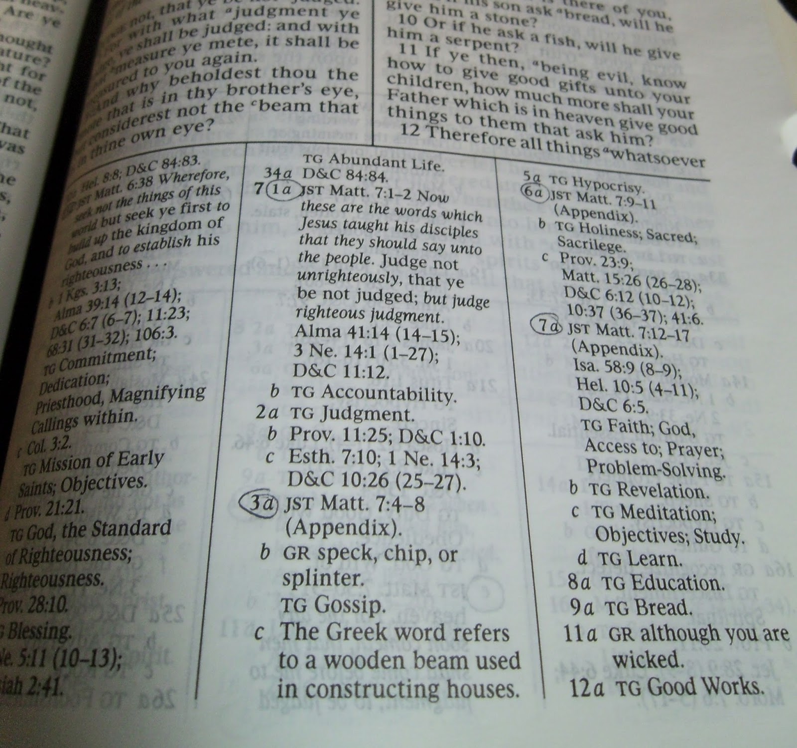
The font for the main scriptural text has been changed. When I opened it up to look at it, I thought, “Whoa, there is something way different about this!” I’m not sure what it is; something about the spacing of the letters is much more even. Words don’t seem chunked together like they were in the old edition. It took me about a day to get used to it, but I’ve decided I like it. They have kept the scriptural text on the same pages so that they don't have to reprint any page number references in lesson manuals.

The font for the Joseph Smith Translation Appendix is the same size as normal scripture text, and that is lovely. It feels like the words are stronger and more real, not some little afterthought that can be ignored.
The font for the footnotes is wayyyy better, much more readable.
Something else I’ve noticed that is exciting to me is that the side-to-side margins are a bit larger than they were before. (Yessssss! More room for writing margin notes!)
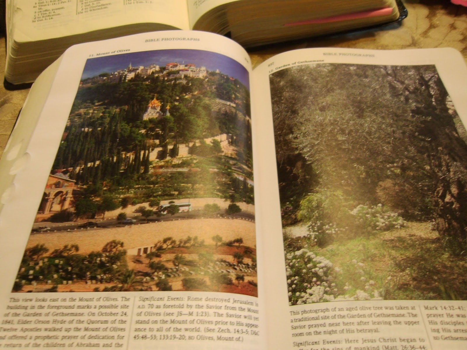
I also noticed that there are more pictures in both the Bible sections and at the end of the Index. Pictures now take up a full page instead of half-pages. They aren’t printed on shiny paper as in the old edition, but their paper is a little thicker than the delicate onionskin used for the rest of the scriptures. And of course, the photos are gorgeous.
If you are interested in seeing a more detailed list of textual adjustments that have been made, you can look here. Probably the most exciting thing to me is that more Joseph Smith Translation has been added to footnotes and appendix.
(Happy sigh) I’m really enjoying my new scriptures. I will grant that I did have a pang or two over letting my old ones go, since they were just beginning to be nicely marked up, but I have faith that I will learn more with the figurative slate wiped clean. (By the way, anyone want my old set? ;-) )
If I could make any suggestion for more improvements I'd just ask for one thing--I would ask for the footnote superscripts to be circled which go to JST footnotes and appendix entries. When I get new scriptures I have to spend 4 hours circling all those superscripts and footnotes so that I can tell at a glance there is a JST entry to consider.
Okay, so you might wonder how much the new edition costs. Well, they aren’t exactly cheap at $60, so you can understand why the brethren have said that we are not required to buy them. But if you can afford it, they are nice.
Do they have mini-quads and large print editions out yet? No. I’ve heard those aren’t available until October, so if you’re a diehard fan of one of those sizes, mark your calendars.
Yaaaaaaaayyyy for scriptures!
Continue reading at the original source →